Product website revamp - MyTAG Pro
UX design | UI design | Project management
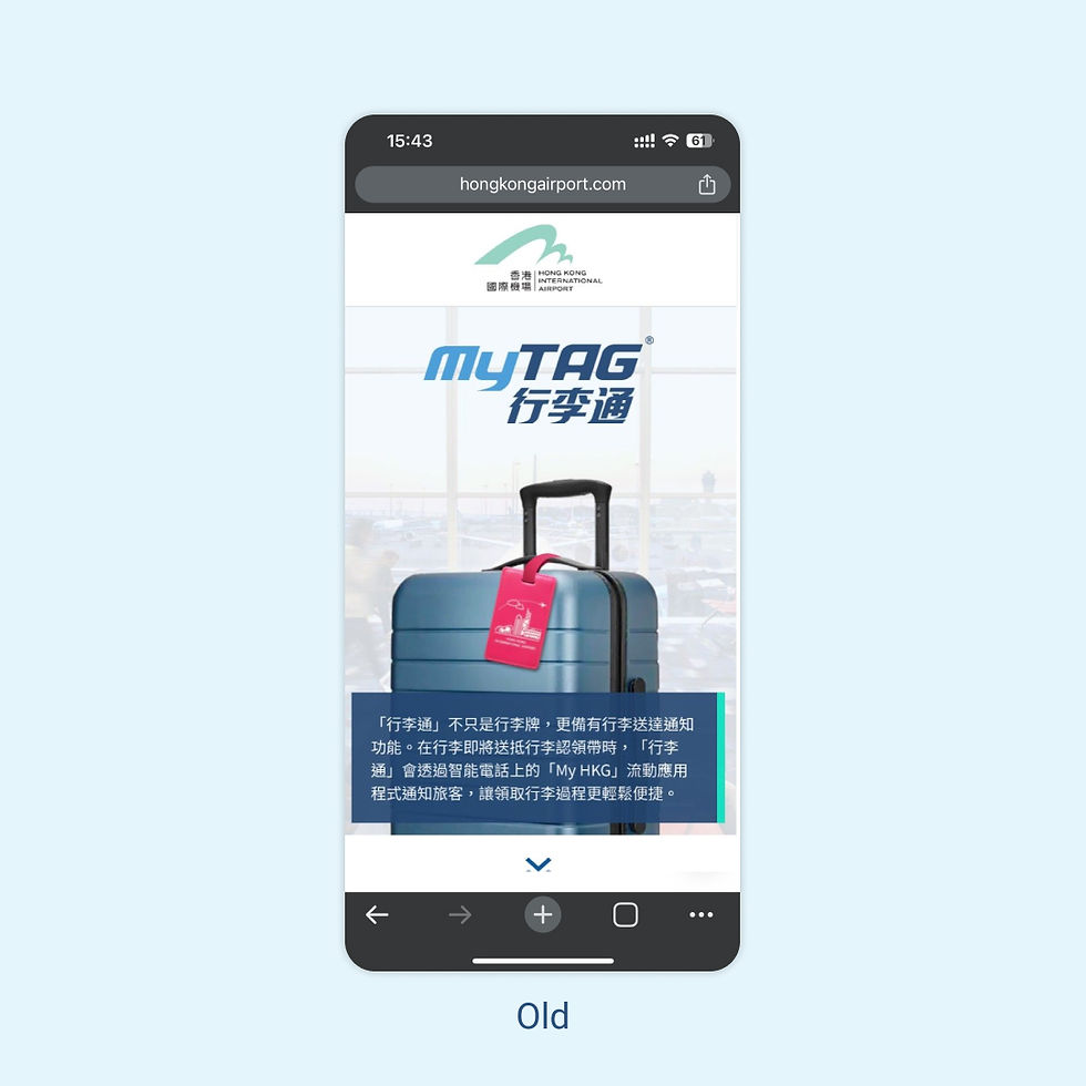
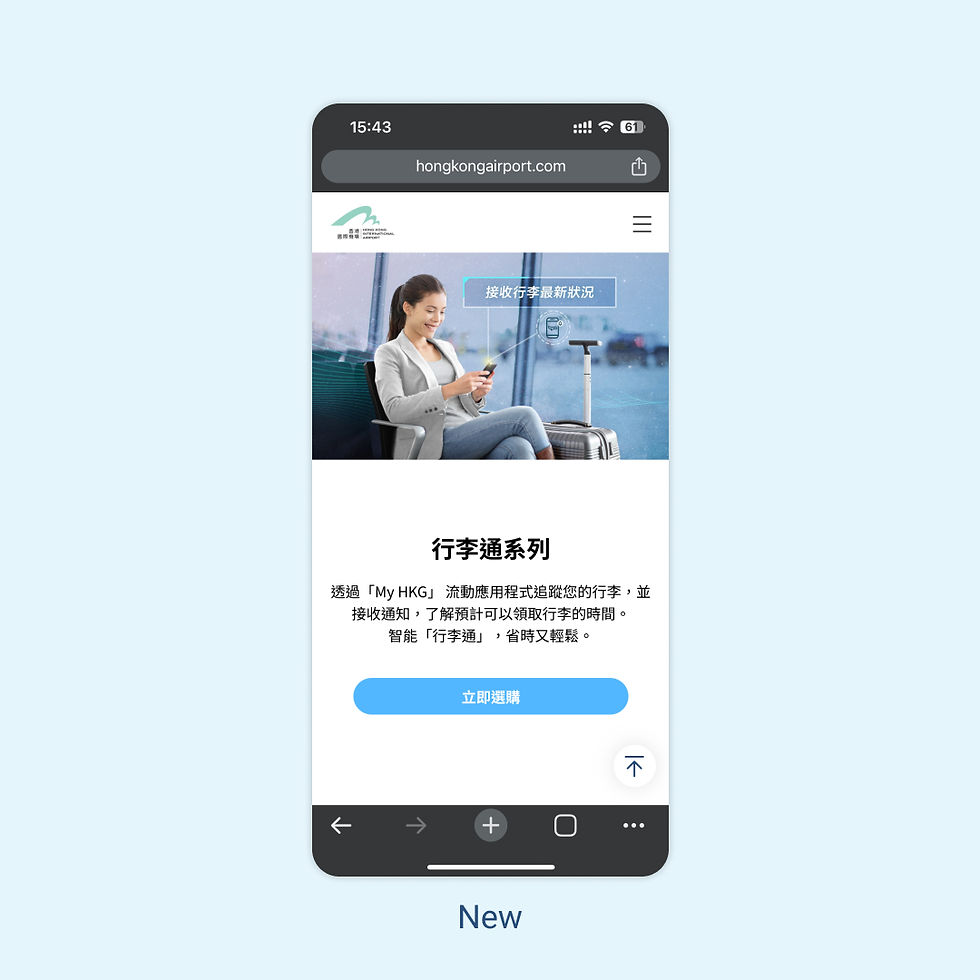
MyTAG Pro is a new launch smart baggage tag. In this project we have to revamp the single page of instructions for MyTAG into the MyTAG Series product website. As their UX/UI designer, I work closely with the team and vendors, focus on enhancing the user experience and interface. The website encompasses a product overview and a quick start guide, catering to the needs of various users. It aims to provide all the necessary information to ensure a seamless experience for both new and existing users.
Hong Kong International Airport
Client
Project Management | UX design | UI design | Prototype | UAT
My role
Responsive Website
Platform
Jun 2022 - Sept 2023
Timeframe
01
Reorganised the information architecture to cater different user’s need
02
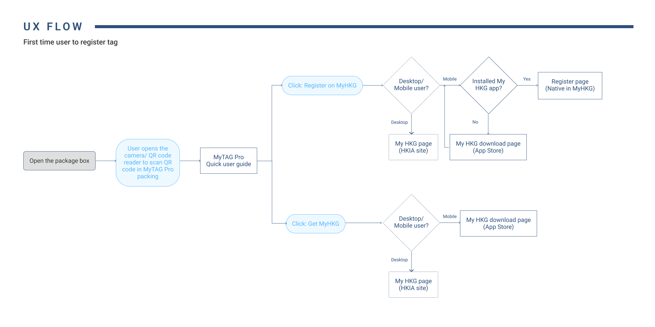
Defined a user experience flow for the first time user of MyTAG Pro and MyTAG
03
Improved website aesthetics
As the sole UI/UX designer, I created the end-to-end experiences of the following features:
My role

Painpoint
Revamp website to accommodate MyTAG Pro launch, providing vital details to new users.
The original site lacks necessary content for MyTAG Pro launch, demanding a redesigned responsive website with product details, registration instructions, and My HKG app access to serve new and general users.


Solution
Reorganised the information hierarchy to make the site more intuitive. I have research for different product site and study their hierarchy.
In the product page, we include the following sessions:
-
Product descriptions with key selling points and product images.
-
Comparison table to show the differences between MyTAG Pro and MyTAG
-
After showing the details, we decided to add a call to action button direct to the e-shop selling page
-
FAQ pages also included in the site, we prepare some questions that might be frequently asked be the customers. A search box included so as to allow user to find the answer by keywords searching.

As the original design is lack of a seamless onboarding experience for first-time users of MyTAG Pro and MyTAG. Therefore I design a clear user experience flow that guides first-time users through the setup process of both MyTAG Pro and MyTAG, ensuring a smooth and intuitive onboarding experience.
UX flow

Decision
Reason 1
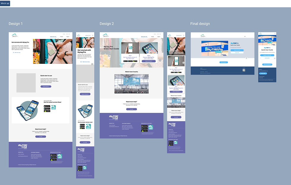
Utilise tabs for seamless navigation between sections, ensuring easy access to related information.
Reason 2
Optimise layout to reduce page length, improving overall user experience.
Reason 3
Prioritise mobile view considerations by using tabs to enhance content clarity and readability.
Reason 1
Streamline scrolling by reducing page length.
Reason 2
Enhance user experience with a clear call-to-action button consolidating different sections.
Reason 3
Improve user comprehension by placing the instruction video prominently at the top.
Decision
As the original design is lack of a seamless onboarding experience for first-time users of MyTAG Pro and MyTAG. Therefore I design a clear user experience flow that guides first-time users through the setup process of both MyTAG Pro and MyTAG, ensuring a smooth and intuitive onboarding experience.
Design process - From wireframe to end product


Problems identified


Design system

Key visuals


